Or ocean acidification is a pHraud! (Geddit?)
My latest heap of clowns are Thomas Lifson, James Delingpole, Anthony Watts and Marita Noon for claiming that ocean pH data do not show a decline in pH. (Hide the decline? Where have I heard that before.)
If the facts won't fit in, why so much the worse for the facts.
Human activity has added a couple of trillion tons of CO2 to the atmosphere, about 30-40% of that has dissolved in the oceans, and dissolving CO2 in water causes acidification, so if the facts of ocean pH observations don't show acidification, it is most likely because there is some complicating factor, not because basic chemistry is wrong.
Unless you are a climate change clown, where it's evidence of a conspiracy by scientists, and never mind the implications. OK, billions of tons of CO2 have dissolved in the oceans: exactly how did that not change the pH?
The explanation I think lies in something that is commented on but passed over in the original article: "[pH] levels coincide with the Pacific Decadal Oscillation".
CO2 does dissolve in water, but more in cold water and less in warm, and ocean cycles like the PDO can bring warmer or cooler water to the surface. They also transport water from the surface to the ocean depths or vice versa. All of which mean that CO2 concentrations in the ocean water (and therefore pH) are not going to change uniformly.
Therefore pH measurements are going to vary depending on when and where they were taken, and without taking into account this complicating factor, you are not going to get an accurate picture of global ocean pH.
Which I suspect is why the scientist doing the work on pH was using a model, a reason for ridicule from the clowns: "models that don’t line up with real-world data..."
Well, that's the point. Models take into account complicating factors, to give a more accurate picture of what is really happening. In fact, they explain why the data don't match the theory.
Whereas rejecting the data without addressing the fact that this would mean overturning a very basic theory is spectacularly unintelligent.
Update: Richard Telford has an excellent analysis.

Global Warming Bozos
Saturday, 27 December 2014
Friday, 7 November 2014

Wednesday, 22 October 2014
The Southern Ocean is cooling
As I wrote previously:
So that extra ice at the Antarctic really is because of cooling.
Paul Homewood becomes my latest global warming bozo for this stupid claim.
He reproduces a graph from Bob Tisdale of Southern Ocean sea surface temperature which shows a decline over the last eight years or so:
 But the sea surface is not the ocean.
The Southern Ocean has been getting a lot warmer at depth over the same period:
 Graphic adapted from this one shown in full in my previous post.
What actually seems to be happening is an increasing stratification of heat: colder surface, warmer depth.
As I discussed in a previous post, it is a paradox of increased Antarctic sea ice formation that it is happening in a warming Southern ocean.
This paradox was discussed at Skeptical Science by John Cook, who makes the following observation, based on a peer-reviewed scientific study:
Paul Homewood, however, uses the decrease in Southern Ocean temperature to ridicule John Cook. An error, and a typical piece of denier personalisation of the argument (Al Gore is fat), which Skeptical Science has identified before.
So, a double bozo award to Paul Homewood. Parp! Parp!
NB: the complexities of the issue are discussed further at Hot Whopper.
To a mind in denial, increasing sea ice at the Antarctic suggests that the world is not warming but cooling.The latest meme to spread round the denial blogosphere is a claim that the southern ocean is cooling.
Or at least that the Antarctic is cooling...
So that extra ice at the Antarctic really is because of cooling.
Paul Homewood becomes my latest global warming bozo for this stupid claim.
He reproduces a graph from Bob Tisdale of Southern Ocean sea surface temperature which shows a decline over the last eight years or so:
The Southern Ocean has been getting a lot warmer at depth over the same period:
What actually seems to be happening is an increasing stratification of heat: colder surface, warmer depth.
As I discussed in a previous post, it is a paradox of increased Antarctic sea ice formation that it is happening in a warming Southern ocean.
This paradox was discussed at Skeptical Science by John Cook, who makes the following observation, based on a peer-reviewed scientific study:
The Southern Ocean consists of a layer of cold water near the surface and a layer of warmer water below. Water from the warmer layer rises up to the surface, melting sea ice. However, as air temperatures warm, the amount of rain and snowfall also increases. This freshens the surface waters, leading to a surface layer less dense than the saltier, warmer water below. The layers become more stratified and mix less. Less heat is transported upwards from the deeper, warmer layer. Hence less sea ice is melted (Zhang 2007).An increase in temperature stratification of the Southern Ocean would seem to confirm the wisdom of John Cook's post.
Paul Homewood, however, uses the decrease in Southern Ocean temperature to ridicule John Cook. An error, and a typical piece of denier personalisation of the argument (Al Gore is fat), which Skeptical Science has identified before.
So, a double bozo award to Paul Homewood. Parp! Parp!
NB: the complexities of the issue are discussed further at Hot Whopper.
Tuesday, 9 September 2014
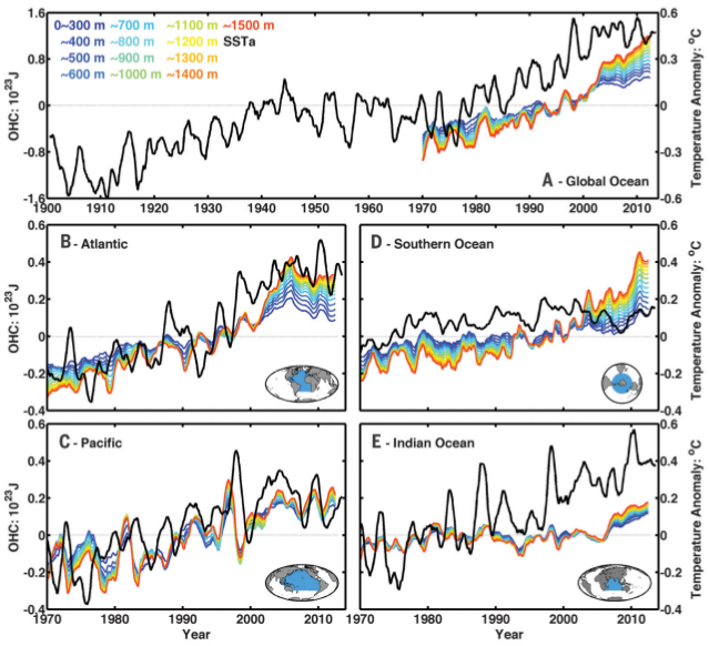
No Warming in the deep ocean
Joanne Nova is a climate change clown. She's claiming the deep ocean is cooling. To be fair, she does notice that the paper she cites is talking about the abyssal ocean, deeper than 2000 metres, but she she then makes a stupid claim that science can't find the missing energy that must be in the climate system after the recent "pause".
Erm, you're looking in the wrong place: when science says it has found the missing heat in the deep ocean, it means the deep ocean up to 1500 metres.
 Chen & Tung (2014), courtesy of Skeptical Science.
The denier bots who paste this stuff round the internet have left out the bit about deeper than 2000 metres completely and are using Wunnsch's paper to claim no warming in the deep ocean full stop:
Joanne Nova goes on to say that even though the deep ocean is cooling, any warming is due to undersea volcanoes. Parp! Parp!
Erm, you're looking in the wrong place: when science says it has found the missing heat in the deep ocean, it means the deep ocean up to 1500 metres.
The denier bots who paste this stuff round the internet have left out the bit about deeper than 2000 metres completely and are using Wunnsch's paper to claim no warming in the deep ocean full stop:
"Wunsch et al claim a deep ocean cooling of 100th of a degree over the last 19 years, but admit that it could be noise."Selective blindness.
Joanne Nova goes on to say that even though the deep ocean is cooling, any warming is due to undersea volcanoes. Parp! Parp!
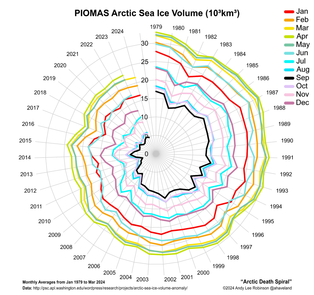
Arctic death spiral reversed.
Arctic sea ice has been in decline since the beginning of the satellite record- it's in a death spiral.
 Source: haveland.com
According to David Rose and Judith Curry in the Daily Mail, the death spiral is reversing.
Which is of course what climate change deniers were claiming after the summer of 2007, when Arctic sea ice "recoved" from a new record minimum.
 Source: NSIDC.
David Rose has a history of misunderstanding and misrepresenting climate science, but Judith Curry is a scientist and should know better.
There are many points above the trend line in the graph above, but they didn't mean that the trend had stopped.
Arctic sea ice is subject to many factors that affect the summer extent. Arctic warming is one, but it is also affected by
Imagine throwing two dice and getting a double six: the best combination of factors for ice melt and a record ice minimum. Although the chance of throwing another double six next throw remains the same, over a period of many throws, you wouldn't expect to see two double six throws together very often. More likely you'll see ideal ice melt conditions one year followed by less ideal conditions for a few years- and minimum ice melt extent above the trend.
This is exactly what you see in the graphs above. Climate change deniers proved themselves to be clowns after 2007 by predicting "recovery". Did they fool anybody? To try it again? Shame on you!
With the next throw of a double six in the coming summers, when conditions line up to be ideal for ice melt, expect a new record low. When subsequent years are less favourable to ice melt, expect the deniers to claim "recovery" again.
(See Albert Einstein quotes to the right.)
According to David Rose and Judith Curry in the Daily Mail, the death spiral is reversing.
Which is of course what climate change deniers were claiming after the summer of 2007, when Arctic sea ice "recoved" from a new record minimum.
David Rose has a history of misunderstanding and misrepresenting climate science, but Judith Curry is a scientist and should know better.
There are many points above the trend line in the graph above, but they didn't mean that the trend had stopped.
Arctic sea ice is subject to many factors that affect the summer extent. Arctic warming is one, but it is also affected by
- Weather- a warmer or colder that average summer, or sunnier or cloudier.
- Wind direction- ice can be blown around the Arctic into areas where it is more or less likely to melt, or where it may be expelled from the Arctic.
- Storms- a big storm at the end of the melt season can break up thin ice- and if it's followed by some sunny weather, the sun will hit dark open water, causing more warming and melting.
Imagine throwing two dice and getting a double six: the best combination of factors for ice melt and a record ice minimum. Although the chance of throwing another double six next throw remains the same, over a period of many throws, you wouldn't expect to see two double six throws together very often. More likely you'll see ideal ice melt conditions one year followed by less ideal conditions for a few years- and minimum ice melt extent above the trend.
This is exactly what you see in the graphs above. Climate change deniers proved themselves to be clowns after 2007 by predicting "recovery". Did they fool anybody? To try it again? Shame on you!
With the next throw of a double six in the coming summers, when conditions line up to be ideal for ice melt, expect a new record low. When subsequent years are less favourable to ice melt, expect the deniers to claim "recovery" again.
(See Albert Einstein quotes to the right.)
Thursday, 3 July 2014
The Antarctic hockey Stick
The Antarctic has set a new record for sea ice.
 source: Talking about the Weather.
The story has become one of the latest global warming denier memes on the internet.
To a mind in denial, increasing sea ice at the Antarctic suggests that the world is not warming but cooling.
Or at least that the Antarctic is cooling, which is exactly what the author of Talking about the Weather, Harold Ambler, suggests as a cause for the increase in sea ice:
Antarctic sea ice has been increasing despite warming temperatures:
 Source: Zhang, 2007
Does that throw doubt on the reality of global warming? No, it should prompt you to look for other factors that explain the apparent contradiction, which of course real scientists are doing:
Just the latest example of many theories.
But opposing ideas are too hard for climate change clowns to juggle; they fall over on their clown noses. Parp!
More ice? Must be cooling! Have a pie in the face.
The story has become one of the latest global warming denier memes on the internet.
To a mind in denial, increasing sea ice at the Antarctic suggests that the world is not warming but cooling.
Or at least that the Antarctic is cooling, which is exactly what the author of Talking about the Weather, Harold Ambler, suggests as a cause for the increase in sea ice:
...the temperature at the South Pole has been declining during the past four decades as well.This statement makes him my latest Global Warming Bozo: sea ice of course does not form at the south pole, it forms in the ocean, and the southern ocean has been warming:
Despite warmer sea-surface and air temperatures over the Southern Ocean, there has been a slight increase in Antarctic sea-ice extent...British Antarctic Survey
Antarctic sea ice has been increasing despite warming temperatures:
Does that throw doubt on the reality of global warming? No, it should prompt you to look for other factors that explain the apparent contradiction, which of course real scientists are doing:
A paper published in Nature Geoscience by Paul Holland of the British Antarctic Survey and Ron Kwok of the Jet Propulsion Laboratory of the California Institute of Technology presented satellite tracking evidence that “reveals large and statistically significant trends in Antarctic ice drift, which, in most sectors, can be linked to local winds”. Jinlun Zhang of the University of Washington has used computer models to study the interaction between wind and ice and in a recent paper he concludes that changes in winds are resulting in both more compaction within the ice pack and more ridging, causing a thickening of the pack and making it more resistant to summer melt. In simple terms, wind drives ice out to sea, creating open water near the ice-edge that is more likely to freeze.reportingclimatescience.com
Just the latest example of many theories.
But opposing ideas are too hard for climate change clowns to juggle; they fall over on their clown noses. Parp!
More ice? Must be cooling! Have a pie in the face.
Monday, 30 June 2014
July 1936 now hottest US month again!
The latest story on all the global warming denier blogs is that July 1936 is the hottest month in the US again. July 2012 was the hottest month in the US for a while, but the figures have apparently, according to wattsupwiththat, been "adjusted", "as if by magic".
 Watts goes on to say:
1936 is now 0.03 degree hotter than 2012, where previously 2012 was 0.2 degree hotter than 1936.
The reason this is so significant for global warming deniers is they like to use the fact that the US was warmer in the 1930s as an excuse to dismiss the reality of global warming, just as they like to use the claim that the world was warmer in the Medieval Warm Period.
It looks from the graph above that the US has been warming over recent years, so the deniers may not have long to enjoy the renewed status of 1936 as the warmest year, but let them relish 0.03 of a degree for as long as it lasts.
This isn’t just some issue with gridding, or anomalies, or method, it is about NOAA not being able to present historical climate information of the United States accurately. In one report they give one number, and in another they give a different one with no explanation to the public as to why.Thus proving himself a clown, because if you look at the page Watts got his graph from (NOAA Climate at a Glance), it states very clearly:
NCDC transitioned to the nClimDiv dataset on Thursday, March 13, 2014.And it doesn't take much research to find that this is an issue with gridding, that NOAA have explained to the public why it happened, and that Watts is talking out of his bottom when he claims it happened "as if by magic".
The switch to the GHCN-Daily-based dataset has little effect on the average national temperature trend or on relative rankings for individual years. This is because the new dataset is based on gridded anomalies produced using the same set of algorithms and corrections that are applied in the production of the USHCN v2.5 dataset. However, although both the USHCN v2.5 and the new gridded dataset yield comparable trends, the finder resolution dataset more explicitly accounts for variations in topography (e.g., mountainous areas). Therefore, the baseline temperature, to which the national temperature anomaly is applied, is lower (cooler) in nClimDiv than in the USHCN v2.5. This new baseline affects anomalies for all years equally, and thus does not alter our understanding of trends.NOAA National Overview - January 2014 New CONUS Temperature Dataset
1936 is now 0.03 degree hotter than 2012, where previously 2012 was 0.2 degree hotter than 1936.
The reason this is so significant for global warming deniers is they like to use the fact that the US was warmer in the 1930s as an excuse to dismiss the reality of global warming, just as they like to use the claim that the world was warmer in the Medieval Warm Period.
It looks from the graph above that the US has been warming over recent years, so the deniers may not have long to enjoy the renewed status of 1936 as the warmest year, but let them relish 0.03 of a degree for as long as it lasts.
Saturday, 28 June 2014
The Pause may pause
Christopher Monckton is claiming there's been no global warming for 17 years and 9 months based on the latest RSS satellite data. (Link)
 Graphic: Wood For Trees.
The claim is rubbish, of course, for the simple reason that this period begins with a super El Nino and ends with a couple of strong La Ninas. If there were no warming, the trend over this period should have been cooling; that it is flat should tell you that there is warming going on.
Monckton seems to understand that the trend will turn positive with the next El Nino event (probably later this year), as the El Nino adds warmth to the atmosphere (hence the title of this post, his words, "the Pause may pause".
But he adds "it may well resume late in 2015."
It's wishful thinking.
As the years pass, El Nino years become warmer and La Nina years less cold, as the full RSS data set shows.
 The further we move away from 1996, the more El Nino years will produce a stronger warming trend, and the less La Ninas will bring it down. Not unless the next El Nino is a lot weaker than expected, and the next La Nina exceptionally strong will the trend return to a flat line: it's going to creep up over time, even though it may take 15 years more before a moderate el Nino year is going to equal the temperature of the 1998 super El Nino.
We are at the end of the "Pause".
Monckton makes another point that warming is less than expected by the models, which is true.
 A comment to his post has a useful link to an RSS analysis, (from which the above graph comes).
The claim is rubbish, of course, for the simple reason that this period begins with a super El Nino and ends with a couple of strong La Ninas. If there were no warming, the trend over this period should have been cooling; that it is flat should tell you that there is warming going on.
Monckton seems to understand that the trend will turn positive with the next El Nino event (probably later this year), as the El Nino adds warmth to the atmosphere (hence the title of this post, his words, "the Pause may pause".
But he adds "it may well resume late in 2015."
It's wishful thinking.
As the years pass, El Nino years become warmer and La Nina years less cold, as the full RSS data set shows.
We are at the end of the "Pause".
Monckton makes another point that warming is less than expected by the models, which is true.
The reasons for the discrepancy between the predicted and observed warming rate are currently under investigation by a number of research groups. Possible reasons include increased oceanic circulation leading to increased subduction of heat into the ocean, higher than normal levels of stratospheric aerosols due to volcanoes during the past decade, incorrect ozone levels used as input to the models, lower than expected solar output during the last few years, or poorly modeled cloud feedback effects. It is possible (or even likely) that a combination of these candidate causes is responsible.But that's a different kettle of fish.
Tuesday, 24 June 2014
The US is cooling!
This claim is the latest hot denier meme. It's rubbish of course, from a global warming bozo called Steve Goddard, but it seems it's not stupid enough, so a pair of even bigger bozos called James Delingpole and Christopher Booker have turned it into
 The animation is a bit dishonest, because it doesn't include the recent data, so here is my own version:
 Looking at the first animation, you might get the impression that higher temperatures at the end of the graph are the result of "NOAA/NASA Dramatically Alter[ing] US Temperatures After The Year 2000". Well, no, they are not: they are the result of warming temperatures in the US.
There is a difference between the two data sets up to 2000: a drop mid century and a rise at the end of the century in the second data set. The rise at the century is because (among other factors) "there has been a widespread conversion from afternoon to morning observation times in the USHCN", which is documented in the scientific literature. NOAA National Climate Data Center.
The warming bias is about 0.2 of a degree, visible around 1990/1995, but notice that average temperatures rise by 0.5 of a degree after that, with the maximum rising by a whole degree: in fact, the latest graph has a new line to fit this new datum, with it's scale rising to 2.0 degrees.
This was of course 2012, the warmest year in the US. Apparently just by leaving this year off the graph the climate change clowns can forget about the heat waves and record temperatures of that year and convince themselves that the US is cooling!
Compensating for a well documented change in time of day of observation in temperature data is not fiddling or fabricating data. Would anybody argue seriously that ignoring this factor gives a more accurate picture of how temperatures have changed?
But there is no serious argument from global warming bozos of course, just stupid conspiracy theories, endlessly echoed by bozo journalists and bloggers.
And I haven't even asked how US temperatures supposedly cooling is taken to mean that global warming is in question.
With each echo, the stupidity grows and the accusations become more clownish.
Global Warming 'Fabricated' by NASA and NOAAand
The scandal of fiddled global warming dataThe claim is based on the difference between the USHCN Version 1 USHCN Version 2 data sets of US temperatures illustrated in these graphs, combined into an animation:
There is a difference between the two data sets up to 2000: a drop mid century and a rise at the end of the century in the second data set. The rise at the century is because (among other factors) "there has been a widespread conversion from afternoon to morning observation times in the USHCN", which is documented in the scientific literature. NOAA National Climate Data Center.
The warming bias is about 0.2 of a degree, visible around 1990/1995, but notice that average temperatures rise by 0.5 of a degree after that, with the maximum rising by a whole degree: in fact, the latest graph has a new line to fit this new datum, with it's scale rising to 2.0 degrees.
This was of course 2012, the warmest year in the US. Apparently just by leaving this year off the graph the climate change clowns can forget about the heat waves and record temperatures of that year and convince themselves that the US is cooling!
Compensating for a well documented change in time of day of observation in temperature data is not fiddling or fabricating data. Would anybody argue seriously that ignoring this factor gives a more accurate picture of how temperatures have changed?
But there is no serious argument from global warming bozos of course, just stupid conspiracy theories, endlessly echoed by bozo journalists and bloggers.
And I haven't even asked how US temperatures supposedly cooling is taken to mean that global warming is in question.
With each echo, the stupidity grows and the accusations become more clownish.
Thursday, 12 June 2014
Aerosols cause global warming!

This is what global temperatures would look like if the aerosol cooling effect dominated over CO2 warming. High aerosol production as a result of global industrialisation would have resulted in cooling temperatures, until attempts to deal with acid rain reduced aerosol emissions in the latter twentieth century.
In fact, temperatures look like this:

Climate science concluded in the late 1970s that CO2 warming would dominate aerosol cooling, so who would be foolish enough to imply the opposite?
A global warming bozo, of course:
A 5-10% decrease in solar energy received at the Earth's surface due to aerosols is huge [up to 136 W/m2], and far more than the ~0.5 W/m2 increase alleged due to man-made greenhouse gases since the beginning of the industrial revolution. A mere 1-2% change in global albedo from clouds/aerosols is sufficient to tip the balance between global warming or cooling.The Hockey Schtick, referring to Global aerosol change in the last decade: An analysis based on MODIS data.
Global warming deniers love to talk about global cooling, and no warming for 10 years, but the paper the Hockey Schtick cites says aerosols have decreased over the last decade, so shouldn't temperatures have gone up?
Wednesday, 11 June 2014
Volcanoes are melting the Antarctic
My first three climate change clowns have looked a paper in the Proceedings of the National Academy of Sciences of the United States of America called Evidence for elevated and spatially variable geothermal flux beneath the West Antarctic Ice Sheet and made some very clownish statements:
The paper itself says nothing about climate change or CO2, which news reports in the general media have reflected accurately.
The scientific press is clear about the reason the west Antarctic ice sheet is melting:
The effects of global warming on the west Antarctic ice sheet have been in the news recently, with scientific studies suggesting warming has pushed the sheet over a tipping point, leading to an inevitable (albeit after 200-500 years) collapse.(See 'Nothing can stop retreat' of West Antarctic glaciers, BBC News.)
Which is probably why the climate change bozos are trying to misuse this latest PNAS paper to suggest that it's just natural warming.
As if these volcanoes suddenly appeared and are melting the ice!
Uh oh: Study says ‘collapsing’ Thwaites Glacier in Antarctica melting from geothermal heat, not ‘climate change’ effectswattsupwiththat
WAIS outlet glacier being melted by magma – not co2 global warming after alltallbloke
Why the West Antarctic Ice Sheet Is Really Melting. (No, It's Not 'Climate Change')
James Delingpole
The paper itself says nothing about climate change or CO2, which news reports in the general media have reflected accurately.
"Before our paper, models tended to just assume a uniform geothermal flux value beneath the glacier because it was the best you could do with the observations available (even though the presence of nearby volcanoes and other geologic evidence suggested it was probably very non-uniform).abc.net
Now, a new study finds that these subglacial volcanoes and other geothermal "hotspots" are contributing to the melting of Thwaites Glacier, a major river of ice that flows into Antarctica's Pine Island Bay.foxnews.com
Researchers have long known that volcanoes lurk under the ice of West Antarctica. This is a seismically active region, where East and West Antarctica are rifting apart. In 2013, a team of scientists even found a new volcano beneath the West Antarctic Ice Sheet.
West Antarctica is also hemorrhaging ice due to climate change.
The scientific press is clear about the reason the west Antarctic ice sheet is melting:
The glacier is retreating in the face of the warming ocean and is thought to be unstable because its interior lies more than two kilometers below sea level while, at the coast, the bottom of the glacier is quite shallow.phys.org
The effects of global warming on the west Antarctic ice sheet have been in the news recently, with scientific studies suggesting warming has pushed the sheet over a tipping point, leading to an inevitable (albeit after 200-500 years) collapse.(See 'Nothing can stop retreat' of West Antarctic glaciers, BBC News.)
Which is probably why the climate change bozos are trying to misuse this latest PNAS paper to suggest that it's just natural warming.
As if these volcanoes suddenly appeared and are melting the ice!
Subscribe to:
Comments (Atom)